In part one and part two of this article series, we designed “Main Menu” screen and did some code to manage scaling of it for various resolutions and aspect ratios. “Main Menu” screen followed the same layout for both portrait and landscape orientations.
In part three we will be working on actual “Game” screen and implement different layouts for portrait and landscape orientations. The game is a number puzzle which contains a 6×6 number tiles grid, 2 additional tiles for displaying current and best scores and another 3 icons for various options.
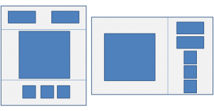
In the image below you will see the alignment of various elements in portrait and landscape orientations. The layouts are different here. In portrait orientation the grid is centered with other elements placed on top and bottom of it while in landscape orientation the grid is moved to the left which takes 2/3rd of the available width and rest of the elements are stacked on top of each other in the remaining 1/3rd space.

Let us look at the code below for key points.
TheGame.MyGame = function (game) {
};

TheGame.MyGame.prototype = {
    preload: function () {
    },
    create: function () {
		this.background = this.add.image(0, 0, "background");
		this.background.height = this.game.height;
		this.background.width = this.game.width;

        // First add all sprites to the game and then position them after scaling
		this.scoreTile = this.game.add.image(-200, -200, "current");
		this.scoreTile.anchor.setTo(0.5);
		this.bestScoreTile = this.game.add.image(-200, -200 , "best");
		this.bestScoreTile.anchor.setTo(0.5);
		this.soundButton = this.game.add.button(-200, -200, "settings", this.toggleSound, this);
		this.soundButton.anchor.setTo(0.5);
		this.soundButton.frame = 2;
		this.newButton = this.game.add.button(-200 , -200, "settings", this.toggleSound, this);
		this.newButton.anchor.setTo(0.5);
		this.newButton.frame = 5;
		this.helpButton = this.game.add.button(-200 , -200, "settings", this.toggleSound, this);
		this.helpButton.anchor.setTo(0.5);
		this.helpButton.frame = 4;

        // Add all grid tiles to the game
        this.initTiles();

        // Position the controls using available width and height in the game
		this.positionControls(this.game.width, this.game.height);

    },
	scaleSprite: function (sprite, availableSpaceWidth, availableSpaceHeight, padding, scaleMultiplier, isFullScale) {
		var scale = this.getSpriteScale(sprite._frame.width, sprite._frame.height, availableSpaceWidth, availableSpaceHeight, padding, isFullScale);
		sprite.scale.x = scale * scaleMultiplier;
		sprite.scale.y = scale * scaleMultiplier;
	},
	getSpriteScale: function (spriteWidth, spriteHeight, availableSpaceWidth, availableSpaceHeight, minPadding, isFullScale) {
		var ratio = 1;
		var currentDevicePixelRatio = window.devicePixelRatio;
		// Sprite needs to fit in either width or height
		var widthRatio = (spriteWidth * currentDevicePixelRatio + 2 * minPadding) / availableSpaceWidth;
		var heightRatio = (spriteHeight * currentDevicePixelRatio + 2 * minPadding) / availableSpaceHeight;
		if(widthRatio > 1 || heightRatio > 1){
			ratio = 1 / Math.max(widthRatio, heightRatio);
		} else {
			if(isFullScale)
				ratio = 1 / Math.max(widthRatio, heightRatio);
		}
		return ratio * currentDevicePixelRatio;
	},
	resize: function (width, height) {
		this.background.height = height;
		this.background.width = width;
		this.positionControls(width, height);
	},
	positionControls: function (width, height) {
		// We would consider landscape orientation if height to width ratio is less than 1.3.
		// Pick any value you like if you have a different preference for landscape or portrait orientation
        var isLandscape = height / width  < 1.3 ? true: false;
		if(isLandscape){
			var availableGridSpace = Math.min(width * 2 / 3, height);
			this.calculatedTileSize = (availableGridSpace * 0.9) / 6;
			this.verticalMargin = (height - 6 * this.calculatedTileSize) / 2;
			this.horizontalMargin = (width * 2 / 3 - 6 * this.calculatedTileSize) / 2;

			this.tileGroup.x = this.horizontalMargin;
			this.tileGroup.y = this.verticalMargin;

			this.scaleSprite(this.scoreTile, width / 3, height / 3, 50, 1);
			this.scoreTile.x = width * 2 / 3 + width / 6;
			this.scoreTile.y = this.verticalMargin + this.scoreTile.height / 2;

			this.scaleSprite(this.bestScoreTile, width / 3, height / 3, 50, 1);
			this.bestScoreTile.x = width * 2 / 3 + width / 6;
			this.bestScoreTile.y = this.verticalMargin + this.scoreTile.height + 50;

			var calculatedSettingsVerticalSpace = height - 2 * this.verticalMargin - 2 * 50 - this.scoreTile.height - this.bestScoreTile.height;

			this.scaleSprite(this.soundButton, width / 3, calculatedSettingsVerticalSpace / 3, 20, 1);
			this.soundButton.x = width * 2 / 3 + width / 6;
			this.soundButton.y = height - this.verticalMargin - this.soundButton.height / 2;

			this.scaleSprite(this.newButton, width / 3, calculatedSettingsVerticalSpace / 3, 20, 1);
			this.newButton.x = width * 2 / 3 + width / 6;
			this.newButton.y = height - this.verticalMargin - this.soundButton.height - 50;

			this.scaleSprite(this.helpButton, width / 3, calculatedSettingsVerticalSpace / 3, 20, 1);
			this.helpButton.x = width * 2 / 3 + width / 6;
			this.helpButton.y = height - this.verticalMargin - this.soundButton.height - this.newButton.height/ 2 - 100;

			for (var i = 0; i < TheGame.Params.fieldSize.rows; i++) {
				for (var j = 0; j < TheGame.Params.fieldSize.cols; j++) {
					this.scaleSprite(this.tilesArray[i][j], this.calculatedTileSize, this.calculatedTileSize, 0, 1, true);
					var tileX = j * this.calculatedTileSize + this.calculatedTileSize / 2;
					var tileY = i * this.calculatedTileSize + this.calculatedTileSize / 2;
					this.tilesArray[i][j].x = tileX;
					this.tilesArray[i][j].y = tileY;
				}
			}

		} else {

			var availableGridSpace = this.game.width;
			this.calculatedTileSize = (availableGridSpace * 0.9) / 6;
			this.verticalMargin = (this.game.height - 6 * this.calculatedTileSize) / 2;
			this.horizontalMargin = (this.game.width - 6 * this.calculatedTileSize) / 2;

			this.tileGroup.x = this.horizontalMargin;
			this.tileGroup.y = this.verticalMargin;

			this.scaleSprite(this.scoreTile, width / 2, this.verticalMargin, 20, 1);
			this.scoreTile.x = width / 4;
			this.scoreTile.y = this.verticalMargin / 2;

			this.scaleSprite(this.bestScoreTile, width / 2, this.verticalMargin, 20, 1);
			this.bestScoreTile.x = width * 3 / 4;
			this.bestScoreTile.y = this.verticalMargin / 2;

			this.scaleSprite(this.soundButton, width / 3, this.verticalMargin, 50, 0.75);
			this.soundButton.x = this.world.centerX;
			this.soundButton.y = height - this.verticalMargin / 2;

			this.scaleSprite(this.newButton, width / 3, this.verticalMargin, 50, 0.75);
			this.newButton.x = this.world.centerX - this.soundButton.width;
			this.newButton.y = height - this.verticalMargin / 2;

			this.scaleSprite(this.helpButton, width / 3, this.verticalMargin, 50, 0.75);
			this.helpButton.x = this.world.centerX + this.soundButton.width;
			this.helpButton.y = height - this.verticalMargin / 2;

			for (var i = 0; i < TheGame.Params.fieldSize.rows; i++) {
				for (var j = 0; j < TheGame.Params.fieldSize.cols; j++) {
					this.scaleSprite(this.tilesArray[i][j], this.calculatedTileSize, this.calculatedTileSize, 0, 1, true);
					var tileX = j * this.calculatedTileSize + this.calculatedTileSize / 2;
					var tileY = i * this.calculatedTileSize + this.calculatedTileSize / 2;
					this.tilesArray[i][j].x = tileX;
					this.tilesArray[i][j].y = tileY;
				}
			}
		}
	},
    initTiles: function () {

		this.tilesArray = [];
        this.tileGroup = this.game.add.group();
		this.tileGroup.x = this.horizontalMargin;
		this.tileGroup.y = this.verticalMargin;

        for (var i = 0; i < TheGame.Params.fieldSize.rows; i++) {
            this.tilesArray[i] = [];
            for (var j = 0; j < TheGame.Params.fieldSize.cols; j++) {

				var tileX = j * this.calculatedTileSize + this.calculatedTileSize / 2;
				var tileY = i * this.calculatedTileSize + this.calculatedTileSize / 2;
				var tile = this.game.add.sprite(tileX, tileY, "tiles");
				tile.anchor.set(0.5);
				tile.value = 0;
				this.scaleSprite(tile, this.calculatedTileSize, this.calculatedTileSize, 0, 1);
				this.tilesArray[i][j] = tile;
				this.tileGroup.add(tile);

            }
        }

    },
    toggleSound: function (button) {
    },
    restart: function (button) {
    },
    help: function (button) {
    }
};
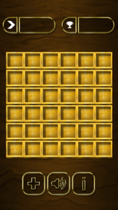
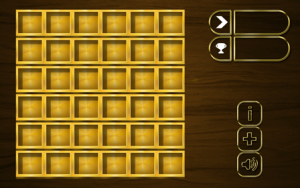
Screenshots of portrait and landscape orientations are given below. You can check demo of “Game” screen on your device here.


We looked at “getSpriteScale” in part two of this article series. There is one change to this method. We are passing an additional parameter “isFullScreen” which will stretch sprite to fit into the available space if available width and height is more than the sprite size. This is required since the number tiles are required to be exact fit in the available space. Current number tiles are assumed to be square but this method can be changed for rectangular tiles accordingly. We don’t have any such need at the moment so we will leave it as-is.
In “positionControls” method we are aligning controls according to their orientation. It actually does not matter whether the game is running on pc or mobile device. All we care for is the available width and height for the game and shall resize everything else accordingly.
There is a landscape ratio we are using in the game which is used to decide when to switch to portrait mode.
In portrait mode
- Puzzle grid is centered and uses the height same as it width.
- Remaining space is divided into upper section and lower section.
- Upper section contains current and high score tiles.
- Lower section contains 3 icons for various options.
In landscape mode
- Puzzle grid is left aligned and is allocated 2/3rd of the available space.
- Remaining 1/3rd space contains current and high score tiles as well as 3 icons for various options which are stacked on top of each other and center aligned to the 1/3rd space.
Next
Working on finishing the game and will post the link to finished game for you to play. Until then.. Happy coding..
Update: I finished the game and a few things changed during the process. Info icon was removed and some more minor changes to the alignment of individual elements but the basic concept remains the same. Check out finished game link below

Great Article! Trying to learn myself. Was curious if you plan to post the final code so we can see how it all came together?
No plan to post entire code as of now. May be down the line if it doesn’t bring much commercial value.
Awesome tutorial! Thanks for tackling this problem that everyone seems to have yet nearly no comprehensive resource on how to solve it.
I’ve noticed that with devices with low base resolutions and a high pixel ratio, the graphics become blurry. Any way to fix this?
If you are using viewport meta tag in HTML and setting width to device-width, you will only get CSS width and height in the method which scales all assets down. If it is possible to not use viewport meta tag to device-width, it will take the actual pixel size (and not CSS width and height) on mobile, which is going to work just fine. In case viewport is set to device-width, I suggest having another set of assets optimized for low resolution.
I’m not using device-width but still having the same problem. Can you take a look at see where the problem is? https://github.com/dwyermt/responsive-template
I see you have chosen base size as 1080×1920 but your images are quite small largest being around 10% of this size. There are two things you need to consider. If you are going for higher resolution (something like 1080×1920) then your assets should be big enough to fit in entire real estate and then only there is an advantage of not using device-width. If you have assets which can only fit in a space of something like 320×480, I would advise using the device-width. RESIZE method gives you width and height accordingly so let say your device size is 320×480 but pixel size is 1080×1920, if you don’t use device-width, you see size as 1080×1920 in your game but if you use device width, then you see size as 320×480 in your game, its just the scaling of images which is making the game look blurry. Increase the size of your assets and you would see crispy clear game on high pixel ratio devices. In fact pixel ratio won’t matter at all if you don’t use device-width since you get pixel size only in your game so game is perfectly scaled.
If you could share a working web URL, I could check it on my iPhone. Can you try my game on your device to see if there is any distortion? I might be interested in scaling my game down to something like 320×480 and then use device-width to see how it looks on high pixel ratio devices.
Your example looks crisp, and I increased the asset sizes which didn’t work. The problem for me is that it is still using the device size, not the pixel size, so it is scaling down too much to match the small resolution. For example, using the chrome device toolbar on a galaxy s5 returns height of 640 for mine but 2560 for yours. I’m not sure how to fix this since I’m not using device width in the viewport tag.
I’m confused about what setting the base resolution does, because doesn’t RESIZE just ignore that and set the resolution based on the parent container?
You are correct. Base resolution is ignored by RESIZE. Base resolution is only to make sure all assets are prepared using that resolution as a baseline. Your assets will ultimately be resized to the width and height you see in RESIZE method. Web games may not have the issue which you are facing since they are using viewport configuration correctly. It might be issue with the Android webview. You must have some configuration option to ignore device-width and let your app see the pixel size. I don’t have much experience with Android app and cordova so can’t help there. Did you try removing viewport tag completely? You should see same height in your game which you see in mine.
Hmm, well I just manually set the width and height based on the device pixel size with SHOW_ALL since I only plan on using mobile and nothing will resize after the first load.
Thanks for the great tutorial and responding to my questions!
SHOW_ALL works great for most cases except the letter boxing. If you can cover background behind the game with something matching with your game and you are using only one orientation, then SHOW_ALL works great. In fact better than RESIZE. RESIZE is for different layouts for different orientations and using the full screen space but needs much more calculations and scenarios to handle which is not required in SHOW_ALL at all.