In previous article I fixed the resolutions I wanted to use for my game, the next step was to set up the game screen and placing the controls on the screen. This is very similar to how it was done for RESIZE mode but for the continuation of this article I will demonstrate the first screen of the game which will give good idea about other screens as well. Then I will focus on the optimization which I am going to try to improve the overall performance of the game on mobile devices.
First thing I do is to fix the area for individual controls so that we can calculate its size and give maximum space available on mobile device. The layout I chose for first screen of my game is something like below
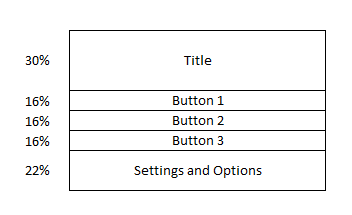
Look at the percentage values. The selected orientation for my game is going to be Landscape. Top 30% area heightwise is for displaying the title. Next three 16% are for displaying 3 different options for the game. Remaining 22% at the bottom is for displaying settings and other icons. Now let us jump at the code. If you remembered the scale methods we did in RESIZE scale mode, we will use the same method to scale our controls to take maximum area. The methods are slightly changed since we have already accounted for pixels while calculating the game’s width and height so we will remove that calculation from the method.
function scaleSprite(sprite, availableSpaceWidth, availableSpaceHeight, padding, scaleMultiplier) {
	var scale = getSpriteScale(sprite._frame.width, sprite._frame.height, availableSpaceWidth, availableSpaceHeight, padding);
	sprite.scale.x = scale * scaleMultiplier;
	sprite.scale.y = scale * scaleMultiplier;
	return scale;
}

function getSpriteScale(spriteWidth, spriteHeight, availableSpaceWidth, availableSpaceHeight, minPadding) {
	// Sprite needs to fit in either width or height
	var widthRatio = (spriteWidth + 2 * minPadding) / availableSpaceWidth;
	var heightRatio = (spriteHeight + 2 * minPadding) / availableSpaceHeight;
	// This works for both the cases
	// If any of the width or hight exceeds available space then scale down the image to fit in the available space
	// If both width and height are less than available space then take the higher ratio and scale image up to fit in the available space
	return (1 / Math.max(widthRatio, heightRatio));
}
Now let us look at the first screen of our game. The first screen is simply the main menu screen and does not have complex game logic but you will get the idea on how we are using the responsive approach to use the maximum available space.
var MainMenu = {
    create: function () {
        var background = mygame.add.tileSprite(0, 0, mygame.width, mygame.height, "background");
        var title = this.add.image(this.world.centerX, -400, "logo");
		// Title to take 30% height from top and will be centered around 15% from top
		scaleSprite(title, mygame.width, mygame.height* 0.3, mygame.height* 0.3 * 0.1, 1);
		title.anchor.setTo(0.5);
        mygame.add.tween(title).to({ y: mygame.height * 0.15 }, 800, Phaser.Easing.Sinusoidal.InOut, true);

        var play6 = mygame.add.button(this.world.centerX, -200, "button6", this.play, this);
		play6.anchor.setTo(0.5);
        play6.clicked = false;
		play6.gameType = 6;
		scaleSprite(play6, mygame.width, mygame.height* 0.16, mygame.height* 0.16 * 0.1, 1);
		play6.y = mygame.height* 0.38;

        var play9 = mygame.add.button(this.world.centerX, -200, "button9", this.play, this);
		play9.anchor.setTo(0.5);
        play9.clicked = false;
		play9.gameType = 9;
		scaleSprite(play9, mygame.width, mygame.height* 0.16, mygame.height* 0.16 * 0.1, 1);
		play9.y = mygame.height* 0.54;

        var play12 = mygame.add.button(this.world.centerX, mygame.height / 2 + 110, "button12", this.play, this);
		play12.anchor.setTo(0.5);
        play12.clicked = false;
		play12.gameType = 12;
		scaleSprite(play12, mygame.width, mygame.height* 0.16, mygame.height* 0.16 * 0.1, 1);
		play12.y = mygame.height* 0.70;

        var shareButton = mygame.add.button(mygame.width - 130, 10, "settings", this.share, this);
        shareButton.frame = 4;
		shareButton.scale.set(0.6);
		scaleSprite(shareButton, mygame.width * 0.1, mygame.height* 0.2, 0, 1);
		shareButton.x = mygame.width - 10 - shareButton.width;
		shareButton.y = 10;

        var helpButton = mygame.add.button(-200, -200, "settings", this.help, this);
		var buttonWidth = helpButton.width;
		var buttonHeight = helpButton.height;

		helpButton.anchor.setTo(0.5);
        helpButton.frame = 3;
		var buttonScale = scaleSprite(helpButton, mygame.width, mygame.height* 0.22, mygame.height* 0.22 * 0.1, 1);
		helpButton.x = this.world.centerX - 2.1 * buttonWidth * buttonScale;
		helpButton.y = mygame.height - buttonHeight / 2 - mygame.height* 0.22 * 0.15 * buttonScale;

        var statsButton = mygame.add.button(-200, -200, "settings", this.stats, this);
		statsButton.anchor.setTo(0.5);
        statsButton.frame = 2;
		scaleSprite(statsButton, mygame.width, mygame.height* 0.22, mygame.height* 0.22 * 0.1, 1);
		statsButton.x = this.world.centerX - 0.8 * buttonWidth * buttonScale;
		statsButton.y = helpButton.y;

		var rateButton = mygame.add.button(-200, -200, "settings", this.rate, this);
		rateButton.anchor.setTo(0.5);
        rateButton.frame = 6;
		scaleSprite(rateButton, mygame.width, mygame.height* 0.22, mygame.height* 0.22 * 0.1, 1);
		rateButton.x = this.world.centerX + 0.8 * buttonWidth * buttonScale;
		rateButton.y = helpButton.y;

        var audioButton = mygame.add.button(-200, -200, "settings", this.toggleSound, this);
		audioButton.anchor.setTo(0.5);
        if (gameConfig && gameConfig.playSounds)
            audioButton.frame = 0;
        else
            audioButton.frame = 1;
        audioButton.clicked = false;
		scaleSprite(audioButton, mygame.width, mygame.height* 0.22, mygame.height* 0.22 * 0.1, 1);
		audioButton.x = this.world.centerX + 2.1 * buttonWidth * buttonScale;
		audioButton.y = helpButton.y;
    },
	stats: function (button){
	},
    share: function (button){
    },
    help: function (button) {
    },
	rate: function (button) {
	},
    toggleSound: function (button) {
    },
    play: function (button) {
    },
    initStatsModal: function () {
    }
};
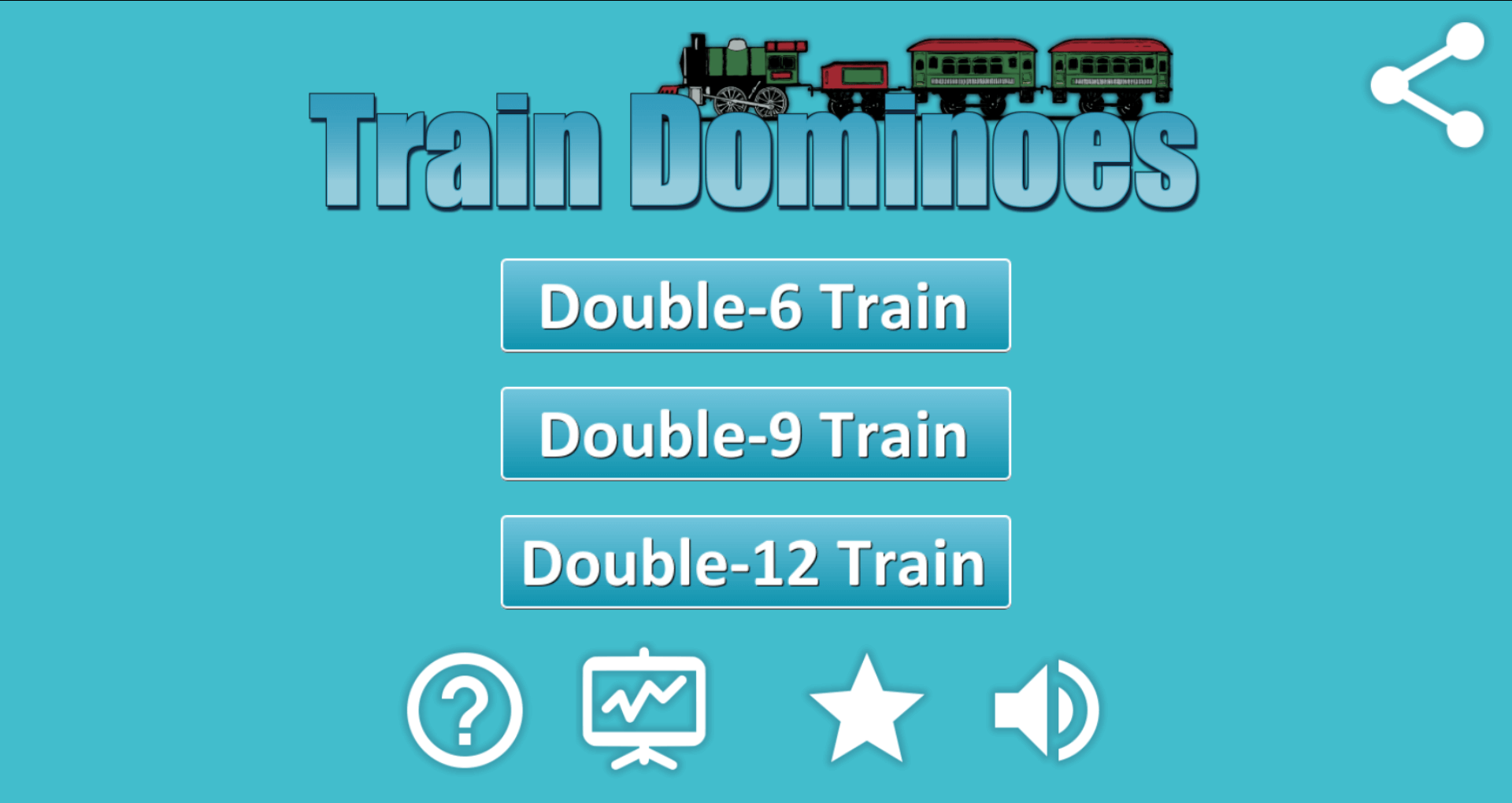
I am using the maximum space which can be given to individual controls and 10% padding is added to all of them so that they are separated with each other and not touching each other. Below are the screenshots from my two devices; one using 1350×900 resolution assets and other using 960×640 resolution assets
Heigher Resolution:
Lower Resolution:
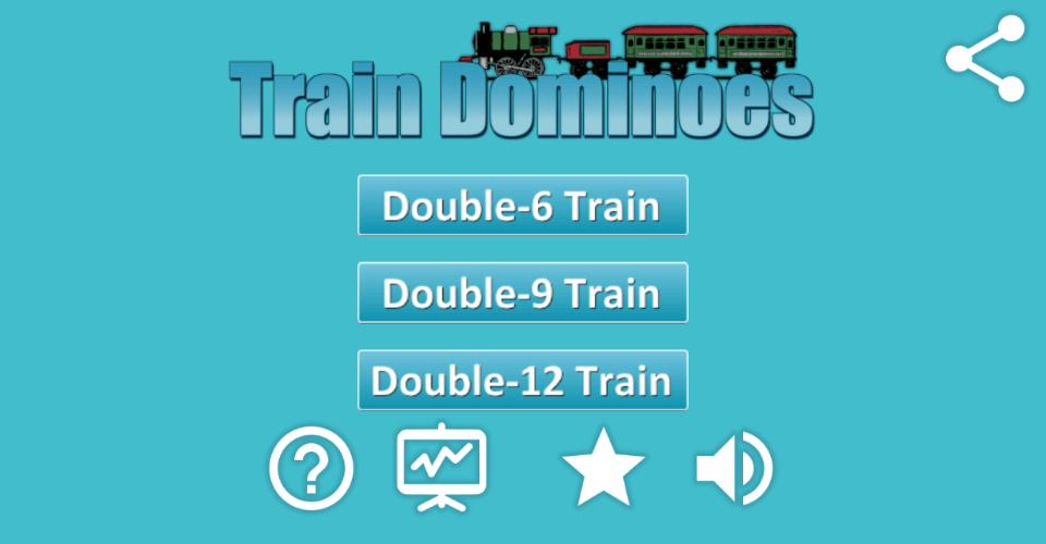
This does not look much different on desktop but difference is pretty clear on mobile devices.
The next screen which is the main game screen has a lot of things happening and it heavily uses sprites and tweens. The game does not use any physics so it should have worked well on mobile devices which are low on processing power but still some of the things are making it run quite slow on my crappy devices so I will jump the code part and start exploring the options to make it run well on my crappy devices. In the next article we will start looking at the changes I had to make to improve the performance of my mobile app.
In the mean while you can check out the game in browser here.